
Visualizing What You (Should) Already Know About RB Production (Again)


BIG WORK, we don't need a scale, man.
- Lil Wayne, musician
Welcome back, friends (again). I’m afraid I have something embarrassing to tell you. The other day I was looking over an article I published and noticed something strange in the first plot…

I was so focused with the middle and upper right sections of the visual that my gaze had previously never traversed over to the lower left quadrant.
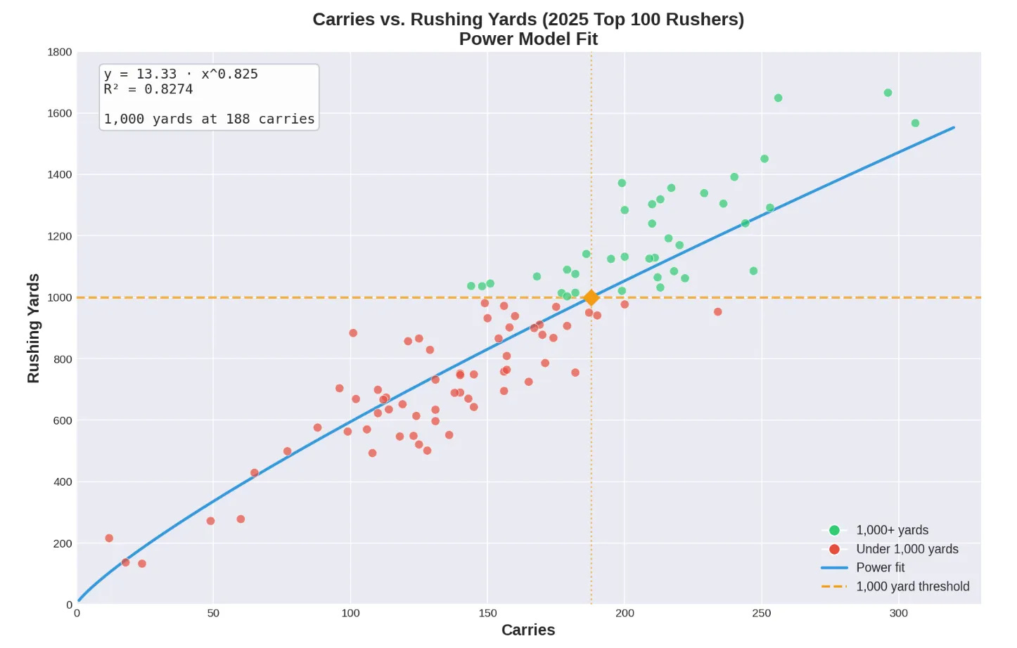
There I found something that made me scratch my head… why are there players with less than 50 carries included in this sample (which was intended to be the top 100 rushers by rushing yards)?
Unfortunately, I had failed to account for the fact that Fantrax’ ordering was by default set to PPG when I downloaded the dataset, and Claude also failed to account for this, and so the sample is really the top 100 rushers by PPG (not top 100 rushers by yardage), and hence why there are some very low carriers in the sample. This also explains why GaSo’s Omari (OJ) Arnold was erroneously left out.
Wow, what an idiot. The good news (for me, at least) is that there is substantial overlap between the two groups, so really the only thing that is ‘off’ is the far left lower quadrant. The vast majority of the players in the middle and right would be the same in both groups.
Nonetheless, it prompted me to redouble my efforts and create another one of these articles for accuracy’s sake (and to do some other stuff that I didn’t get to the first time).
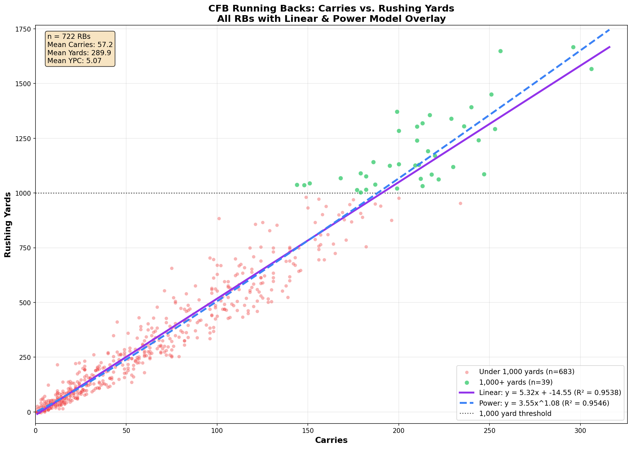
CARRIES VS. RUSHING YARDS
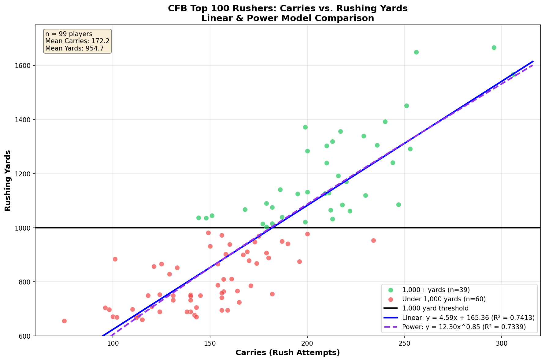
OK, this one looks much better. The lowest carrier included now is Oregon freshman Dierre Hill, with his measly 75 attempts (8.7 YPC). I double checked and yes, he’s in the top 100 rushers in the dataset downloaded from Fantrax (now correctly sorted by rushing yardage).
The power curve equation is very close to what was presented in the previous article, reflecting what I mentioned earlier about sample overlap between the two groups plotted. The linear curve interpretation still doesn’t make any sense if you plug in low values for ‘x’, so I maintain that the power curve is the more appropriate fit here.
One fact that I didn’t point out last time is that CAL’s Kendrick Raphael (now at SMU) and HOU’s Dean Connors are the only two runners failing to rush for 1000 yards with 200 or more carries out of a group of 27.
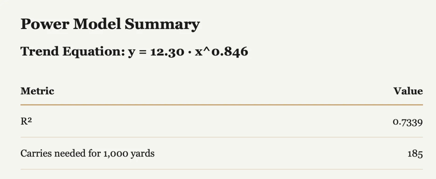
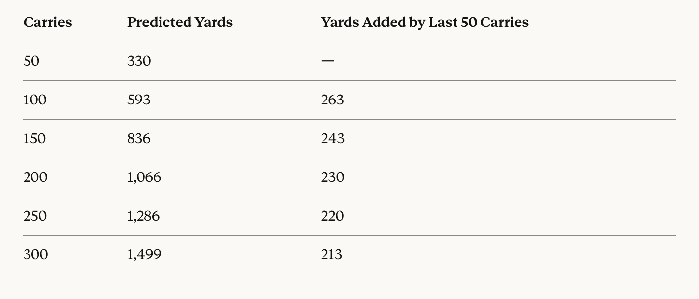
These figures are also closely aligned to what was presented in article one. There’s actually a slight decrease in the model’s estimate of minimum carries typically needed for 1000 yards rushing (was previously 188 in the other article).1
And the more I thought about it, the more I thought: why am I being a stingy bastard about this? Include the whole sample of RBs! So that’s what I did this time:
A FEW OBSERVATIONS
Interpreting Linear curve equation makes (some) sense now: If you plug in zero carries, the resulting expected output is -14 yards, which is still off, but not impossible. One carry yields an expected yardage of -9 yards, and by carry three were at positive yardage somewhere between zero and one. This is more or less reasonable.
Power curve no longer reflecting diminishing returns (b = 1.08 > 1): With the entire sample included now, there are many low carry players included in the model. These players are not getting the opportunity to fatigue and/or face loaded boxes. They would also be prone to skewed YPC averages. There is also a selection effect; in theory, backs who are productive on limited touches keep getting opportunities. A player who gets 5 carries for 8 yards may not get a lot more carries, while a player who gets 5 carries for 40 yards might earn more work. This would create a steeper-than-linear relationship at the low end of the curve.
Remember last time when I talked about how there’s probably a sweet spot regarding the relationship between increasing and decreasing returns on carries? No? Well, that’s fine—my feelings are little hurt—but I did mention it. I was speaking from the perspective on a per game basis (e.g., you can’t judge a player on his first 10 carries, and after 25 or so most probably decline in performance).
Since I don't have access to chronologically ordered carry data on a per game basis for each player, it’s not possible to investigate this further. But what we can do is use groups of players who finished at different carry volumes over the course of the season, and evaluate where the difference tends to manifest between increasing and diminishing returns around carry volume.
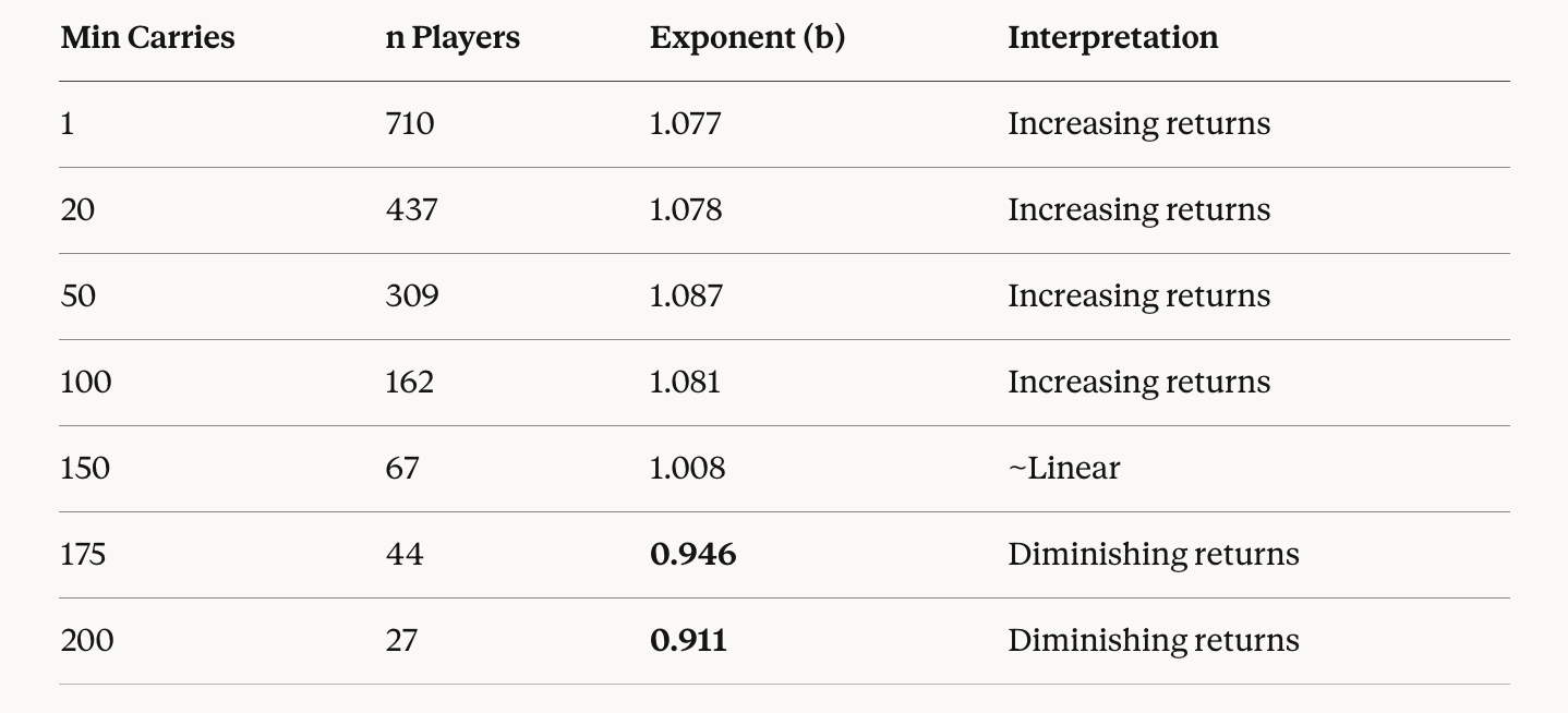
Due to small sample sizes at the extremes I chose a cumulative approach (710 is the total player pool, 437 includes all players with min. 20 carries, and so on). This is not ideal. The best way to do what I’m looking for is to create my own data that includes a dimension of chronology for carries (maybe a project for later), so that I can compare YPC for the same players at different workload levels.
As mentioned in the earlier article, there is likely to be a correlation in player ability and the opportunities they receive, so the players who are represented at each carry volume creates sample selection bias. Though, because of segmentation of CFB (P4 vs. G5), not every yard or stat is created equal, which helps control for this somewhat.
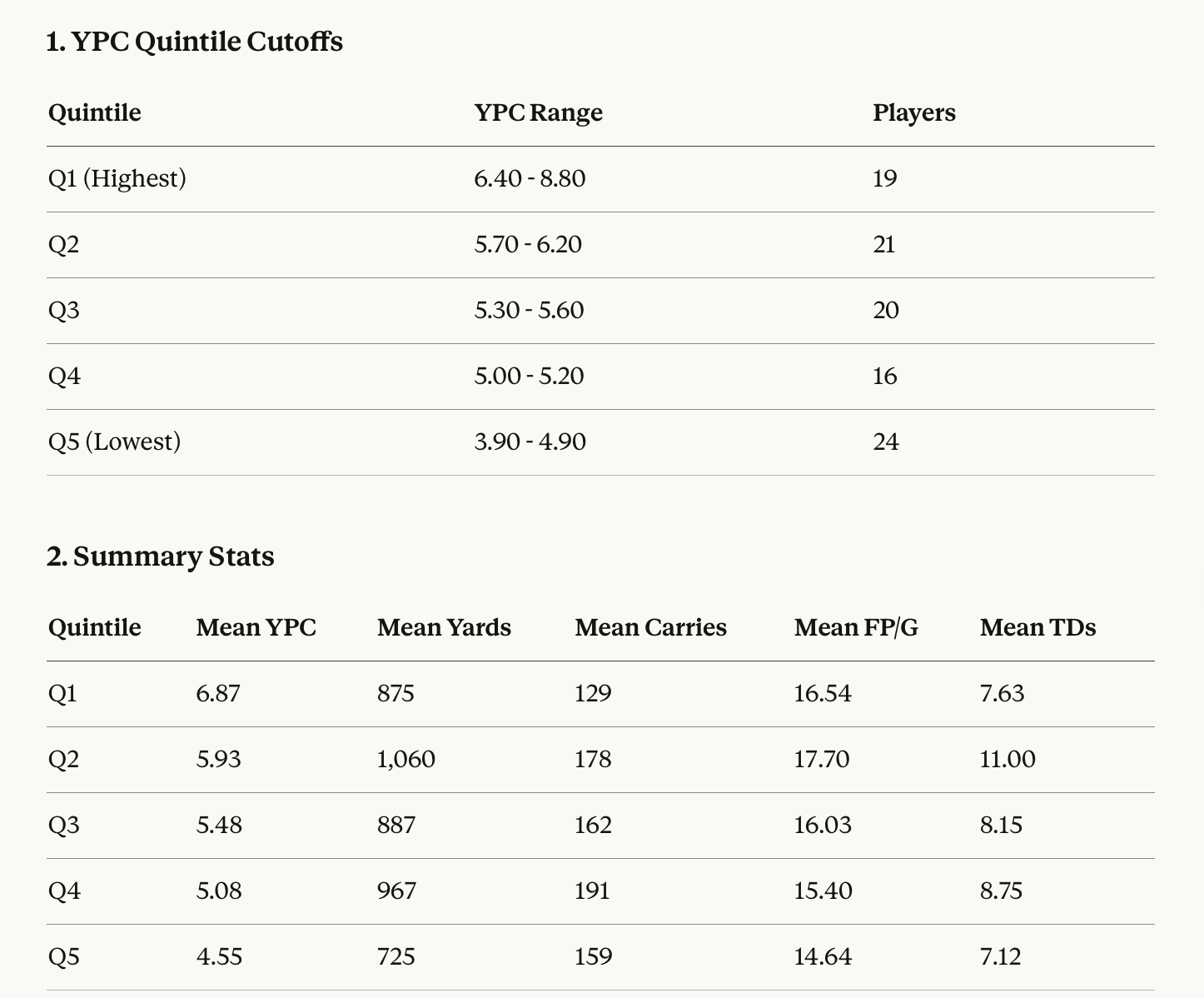
QUINTILES
I decided to see what the YPC quintiles would be if we looked at all RBs with at least 20 carries, and what average outputs look like from these groups:
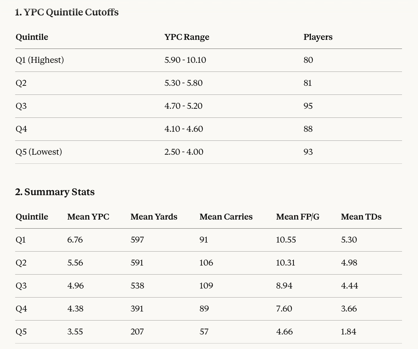
Immediately one thing to point out (and you need to keep this in mind for the rest of these tables) is that because there are ties at various YPC averages in this group, the pool is not split evenly into uniform group numbers. It wouldn't make sense to split players into different groups despite averaging the same YPC. That’s the reason we don’t see even groups.
You might have expected that each quintile (in theory representing 20% of the pool each) would have the same number of players. Q1, for example, in this sample is more like 18% rather than the expected 20%. For simplicity, I’m just going to refer to each quintile as ~20% (approx. 20%) unless I’m being really specific.
Q1 is the top ~20% of rushers by efficiency, and this group averages around 6.76 YPC. Conversely, the bottom ~20% of rushers (Q5) average around 3.55. The runners who average at least ~5 YPC are pretty similar in output performances (Q1, Q2, & Q3).
Another thing to note is that—despite a big difference in efficiency—Q4 is not too far behind Q1 in terms of mean carries. Though it shouldn’t be surprising that the highest quintile group aren’t the highest in average carries. It’s easier to skew numbers (e.g., YPC) in a smaller sample of opportunities than it is on huge workloads.
My expectation is that most of the workhorses who finish as top 30-40 players in CFF would live in the Q2 and Q3 groups. It just also happens to be that a bunch of lower performers will also be in those YPC quintile groups, so output stats won’t look noticeably different from Q1 when taking the mean of each.
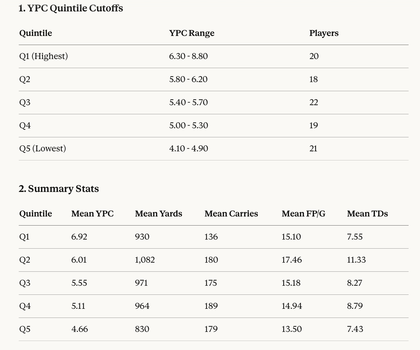
With that in mind, let’s isolate the group down to the top 100 RBs in terms of PPG and see what it says now:
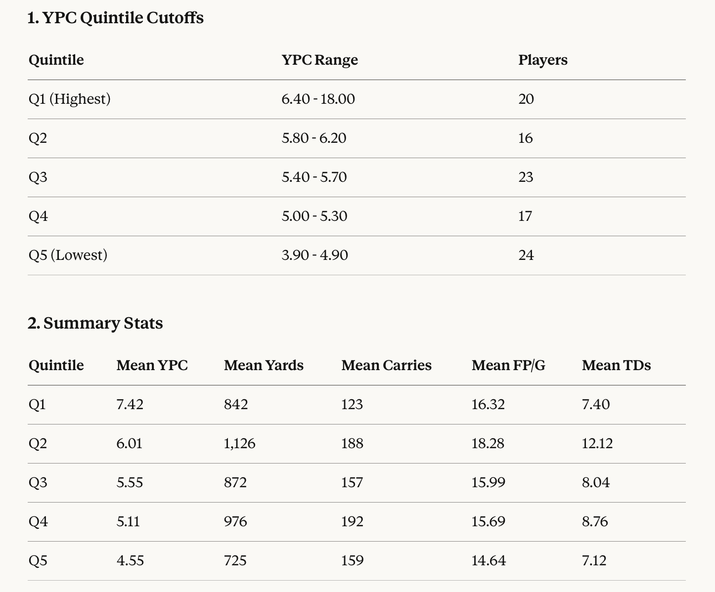
Now you might be thinking, while looking at that ‘18 YPC’ figure in the Q1 quantile under YPC range, aw hell—VP’s gone and made another mistake, what an idiot.
I had a similar thought and then investigated if there really was a player in the sample that averaged 18 YPC and indeed, there is. FSU’s Micahi Danzy finished with 18.0 YPC on just 12 carries for 216 yards.
He's a backup/change-of-pace back who hit some big plays on limited touches. His 12 PPG squeaks him into the top 100 by PPG (he's right at the cutoff), but that YPC is clearly a small sample size outlier rather than a sustainable rate.
Let’s do this again without Micahi Danzy:
Well, I suppose it does say something that 76% of this group (Q1-Q4) averaged 5+ YPC on the year. And once again, Q1 is not the group that are the most productive, despite the highest efficiency. The workhorses still seem to live in Q2, Q3 and now also in Q4 within this newly filtered sample group.
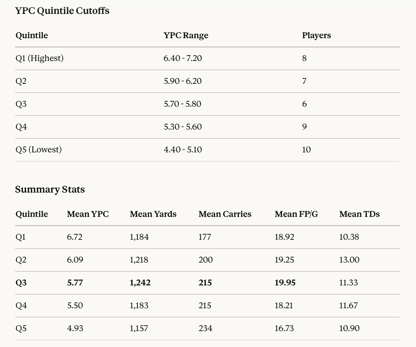
Let’s filter it down even more now, to the top 40 RBs in PPG:
At this point I was a bit confused about those Q1 mean carries (and you might be too) until I realized that there are players like Navy’s Eli Heidenreich (77 carries, 499 yards, 19 PPG) included in this sample group due to their receiving usage, yet we’re primarily focusing on rushing usage and output stats in these tables.
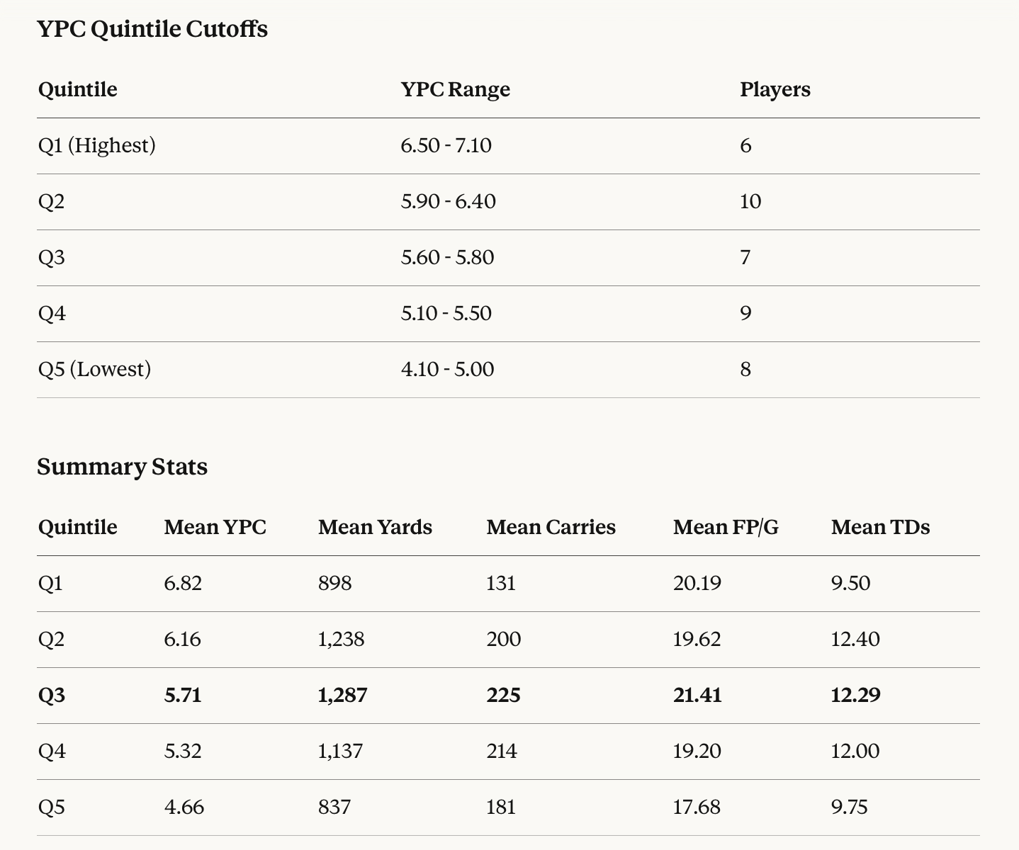
Oh brother. Let’s try this again from square one… now with the top rushers by yardage (bye bye Eli):
The humorous trend of literally everyone out-carrying poor Q1 (and by a large margin) continues.
I think this reflects that lower samples are easier to skew YPC stats upwards, and that the players in Q1 of this sample aren’t necessarily the most efficient because they’re the highest ability players, but more so: they’re the most efficient because they’re decently good combined with a smaller share of opportunities relative to the other groups.
One illustration of the benefits offered through higher efficiency players is in studying Q1 vs. Q5 in this table.
Q5 were given the benefit of many more opportunities in 2025, yet lagged behind Q1 in every production category. This communicates a point that I’m sure we’re all aware of but I’ll say it out loud anyways: there is a point between volume and efficiency where it’s better to have the lower-touch, hyper-efficient player in CFF.
However, because 80% of the sample of top 100 rushers are predominantly averaging 175-189 carries (Q2-Q5), it’s reasonable to still prioritize volume when drafting and acquiring players in CFF leagues.
In addition to the over-representation of “volume pigs” in this sample, the most important reason why prioritizing volume is an effective strategy in CFF is because it’s much easier to predict where volume is going ahead of time than it is to predict who the best players are, or who will be the most efficient on a YPC basis.
If my eye for talent could reliably suss out who the best players were ahead of time, all the time, then I’d be getting paid millions with an NFL or CFB organization currently. Instead, I’m just some asshole with a laptop who spends far too much time thinking about where touches will be distributed and I’m (more or less) just as effective in the CFF context.
You’ll occasionally end up with some Q5 duds, sure, but for every Q5 dud (21) there is approximately three from Q2, Q3, and Q4 (18 + 22 + 19 = 59). The odds are in your favour prioritizing volume when searching for the players who will be most productive at year’s end. And even then, ‘Q5 dud’ is a relative term here. These guys are still better than most CFB RB assets within the CFF context.
Let’s further illustrate the point by filtering the sample down to the top 40 rushers in terms of yardage now:
Our old friend and consistent trend of other groups out-carrying Q1 is still here to greet us, but the mean carries reflects that the sample is now predominantly comprised of the true workhorses, even at Q1.
Out of interest, I checked who was still kicking around with lower carry volumes in this sample: GaSo’s OJ Arnold (144), UNLV’s Jaiden Thomas (148), Utah’s Wayshawn Parker (149), UTSA’s Robert Henry (151), and Arkansas’ Mike Washington (168) are the only ones with less than 170 carries in the group.
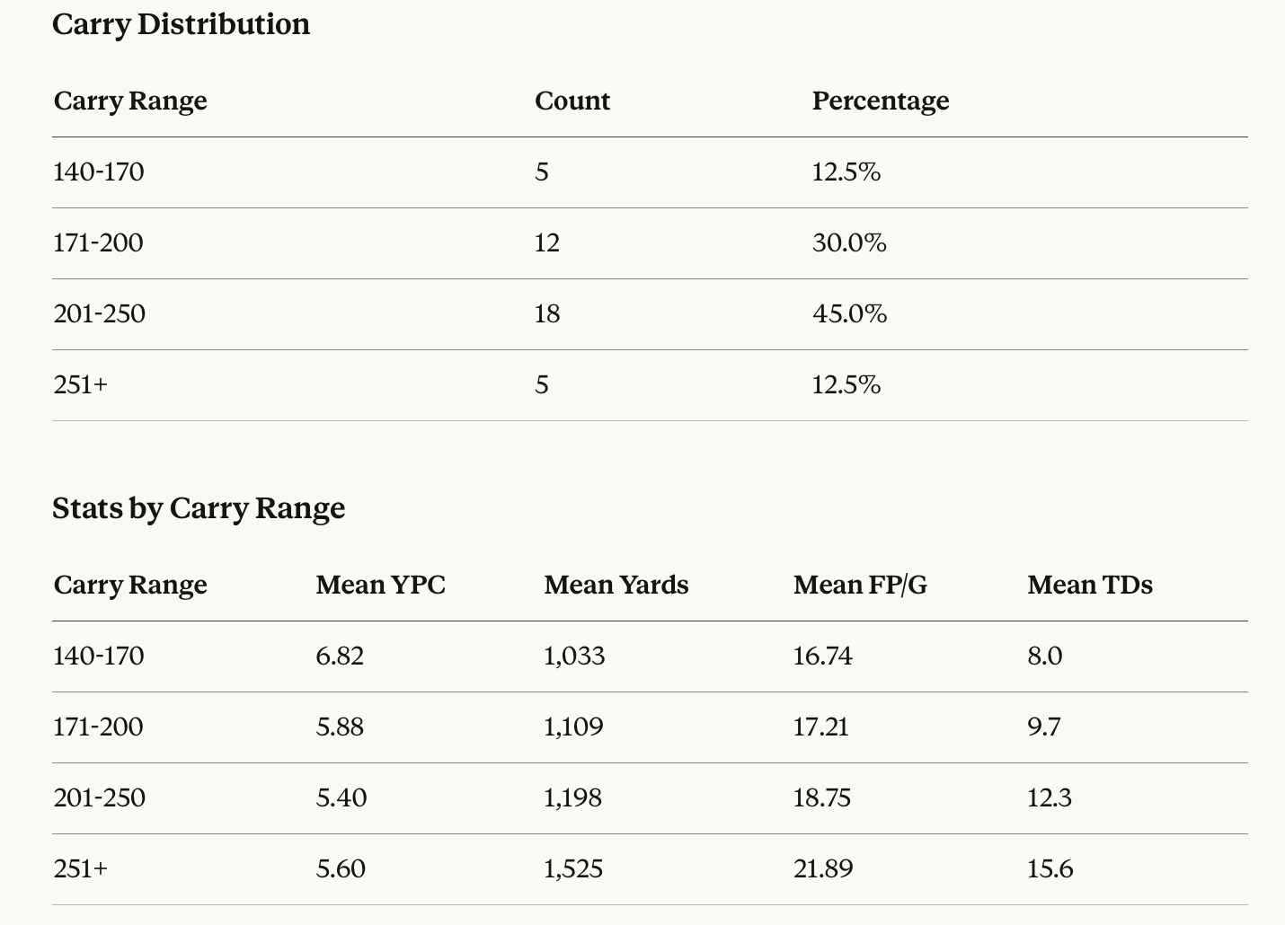
Here are the characteristics of this group separated by carry range:
Notes:
The 201-250 range is the most common (45%) among top 40 rushers
The 140-170 group has the highest YPC (6.82) but lowest fantasy production—these are efficient backs who just don’t get enough volume
The 251+ alpha pigs dominate in PPG (21.89) and TDs (15.6)
Only five backs cracked 250 carries or more in 2025 (how depressing): Cameron Cook, Ahmad Hardy, Kewan Lacy, Emmett Johnson, and Lucky Sutton. For some perspective, 20 years ago, in 2005, there were 14, and 10 years ago, in 2015, there were 18.
TOUCHES VS. PPG
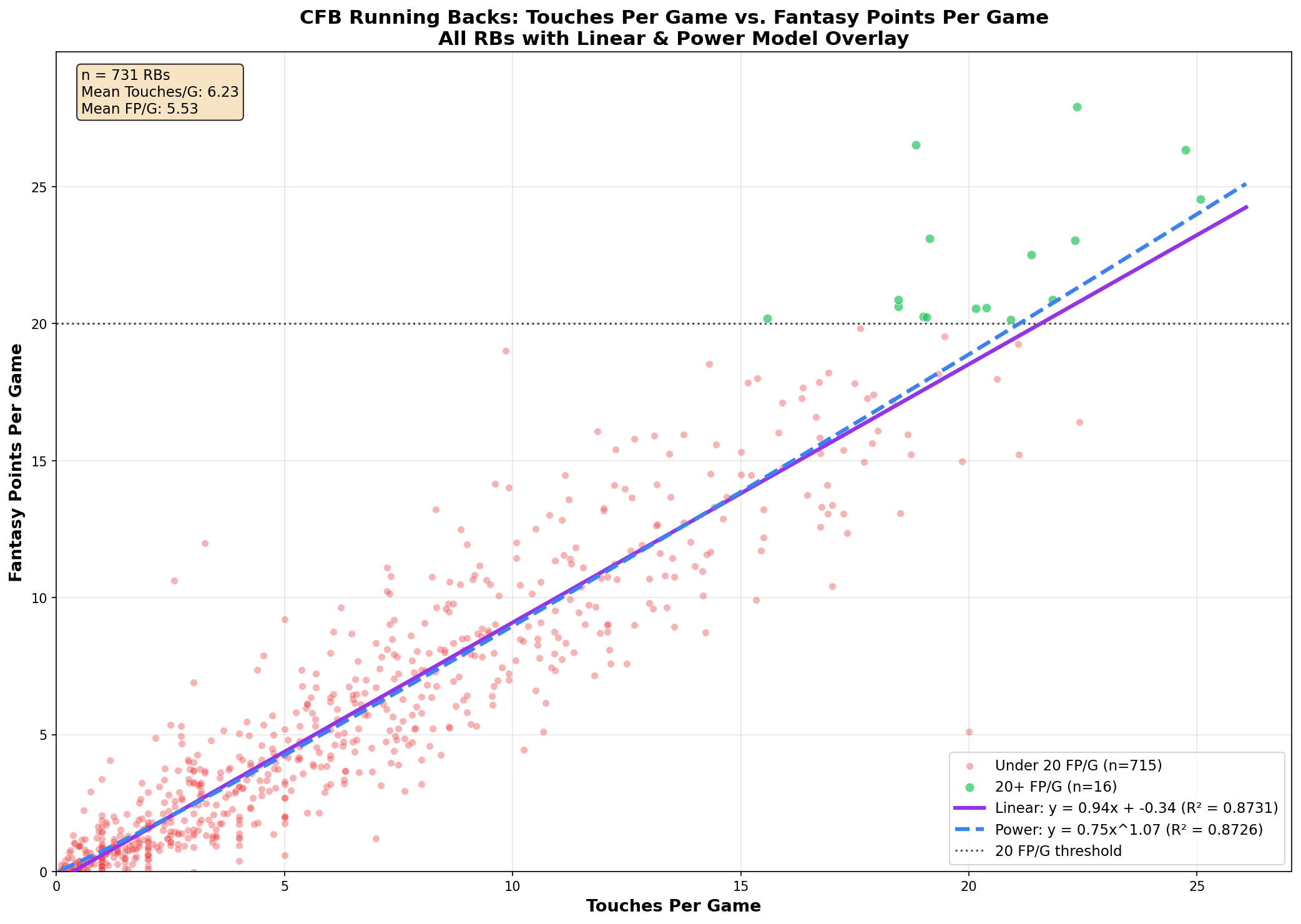
Once again, we’ve now got the full picture plotted. I think if there’s one takeaway here, it’s just how rarified it is to find an elite CFF producer at RB in this day and age. That’s a lot of red dots, bruv… and the greens are few and far between. Though, as expected, the green group are all clustered in the same area of the plot.
One thing I didn’t get a chance to do in the last one was break down workloads by receiving volume. You can see in the picture below that the receiving shares—even within just the top 25 RBs by PPG—varies quite a bit:
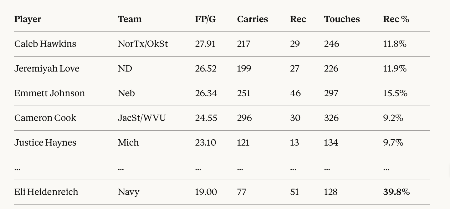
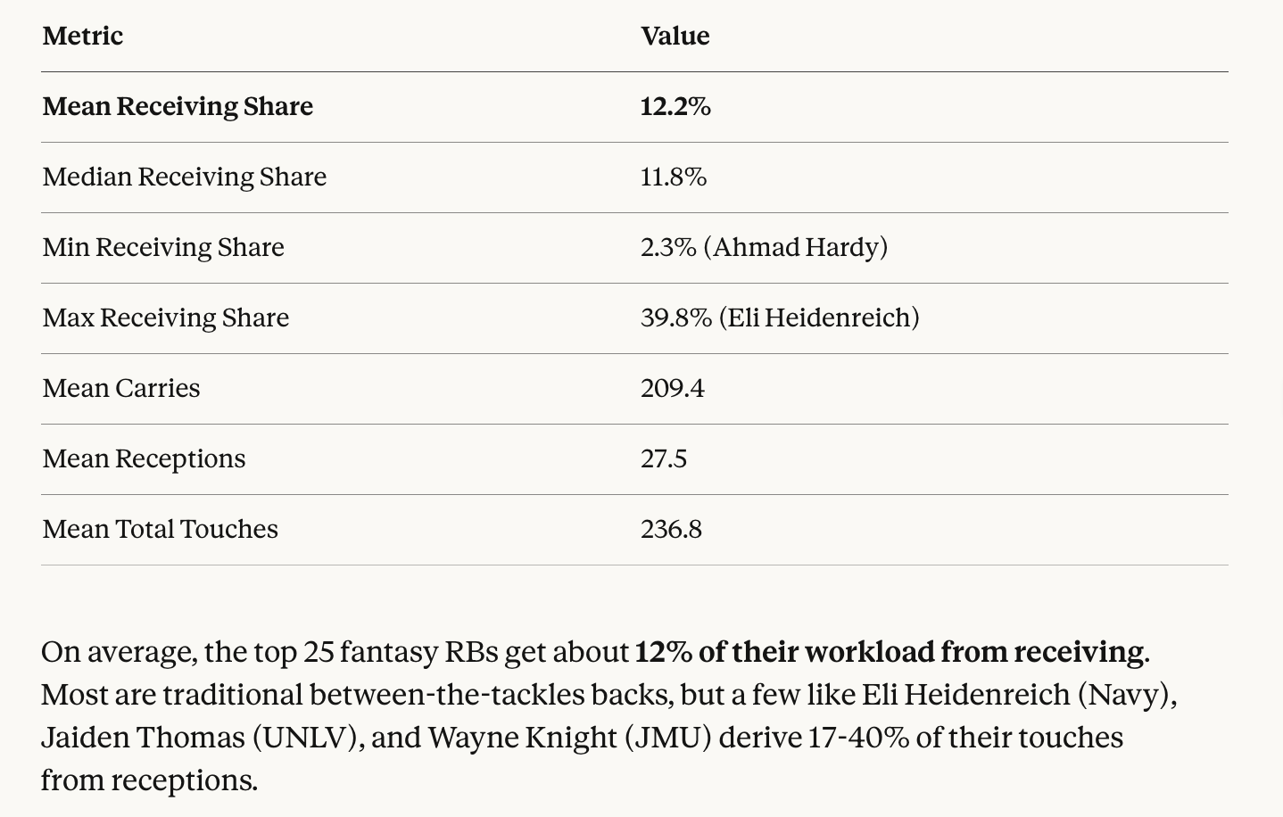
Indeed, aerial usage can be a great equalizer for those players who see lower carry volume. There may be no more extreme example of this than Navy’s Eli Heidenreich, who is sort of a RB/WR in that offence. He’s an outlier.
Behind him is Jaiden Thomas at ~20%, former JMU RB Wayne Knight, UW’s Jonah Coleman and UVA’s J’Mari Taylor each at ~16%
It should also be noted that some players in the samples used today played in 12 games, while others played in as many as 16. This will partly skew the data when looking at aggregate stats (e.g., IU now has two 1000-yard RBs, yet neither were rostered in most CFF leagues in 2025).
Additionally, harder competition in the CFP could skew down PPG averages (Ole Miss’ Kewan Lacy, for example, was averaging 25 PPG entering the CFP, finished with 23).
If you enjoyed this content and would like to read more, I recommend joining the Pigpen, a community of thousands of degenerate college football fans:
This is interesting to me because my general rule of thumb has always been that 200 carries are the necessary input value to expect 1000 yards output. A player who finishes with 200 carries across 12 games is averaging just over 16 per appearance, which by extension makes him a candidate to finish with 20+ PPG.